Landing Page Optimization: Importance, Benefits, Procedure and Best Practices of Optimising Landing Page for eCommerce Companies in 2026

Landing pages are created by marketers to generate leads and they need to be optimized. They make excellent test beds for experimentation and optimization. They are usually specifically targeted and more managed in terms of the traffic that is received each month, whether they are created for SEO (search engine optimization) or paid advertising marketing campaigns. As a result, it is a fantastic place to discover what works and what doesn’t.
Consider that if you can reduce your customer acquisition cost by 1% while increasing your landing page conversion rate, it allows you to extend your efforts across multiple campaigns and keywords by reinvesting in further paid advertising or even more landing pages. Efficiency is the key to success. We will take a look at the importance of eCommerce landing page optimization, elements involved, steps to achieve it and 14 best practices to enhance your landing pages.
- What is Landing Page Optimization?
- Importance of Landing Page Optimization
- Elements of eCommerce Landing Page Optimization
- 4 Easy Steps to Optimise Landing Pages in eCommerce
- 14 Best Practices for Landing Page Optimization in 2026
- Make Your Offer Clear
- Simplify Your Landing Page
- Use Contrasting Colors
- Keep the Important Section Above the Fold
- Use Scarcity Techniques
- Keep Your Call-to-Action Buttons Straightforward
- Add Contact Information
- Try Different Headlines
- Be Consistent With Your Brand Image
- Add Testimonials to Convert Leads
- Experiment With Forms Sizes
- Optimize Your Landing Page for SEO
- Try an Exit Popup
- A/B Test Every Aspect of Your Landing Page
- Conclusion
- Landing Page Optimization: FAQS
What is Landing Page Optimization?
The act of enhancing or improving each component of your landing page in order to enhance conversions is known as landing page optimization. You can use statistics and anecdotal evidence rather than redoing the entire page based simply on a gut feeling. Before your landing page ever goes live, you can gather the necessary data. You can have a better understanding of what your audience wants and expects, for example, by surveying them. You won’t, however, produce the ideal landing page right away. Instead, you need to make adjustments after your website is live while you evaluate the data and track your conversion rate.
WareIQ, an eCommerce fulfillment company, empowers online brands with a superior-tech platform to compete with Amazon like service levels by bringing their average delivery timelines from 5-10 days to 1-2 days.
Importance of Landing Page Optimization
Campaigns for online marketing often include landing pages. A landing page is a web page created specifically to increase sales or gather leads. Many monetary resources are used to direct people to landing pages, which are frequently the focus of paid online marketing campaigns. Since landing pages are designed to increase conversions, optimizing their effectiveness can significantly boost business outcomes. By conducting landing page optimization, you can ensure that the visitors that view it convert at the maximum rate feasible. You can increase the value of your ad spend, increase client acquisition, and decrease customer acquisition costs using eCommerce landing page optimization.
Elements of eCommerce Landing Page Optimization
Descriptions
Write material that is compelling and straightforward to encourage your readers to take action. Develop your relationship with them by being clever and original. Before introducing the features, highlight your advantages and describe what you can offer your customers. Make it simple to read and understand your headlines and body material by using easy-to-scan bullet points, stressed words, sentences, sub-headlines, etc. Do not undervalue descriptive landing pages. Today’s marketing relies more than ever on content, but for some reason, many marketers don’t give it enough attention.
Call to Action (CTA)
Make a call to action (CTA) that is distinct from the rest of the copy and design. Using contrasting colors or enclosing the CTA button in white space to set it apart from other elements is typically a smart idea. Think about various shapes, sizes, arrangements and patterns. It is crucial to choose the proper shape and size since you want it to be inspiring and attractive without being excessively enormous, which could overwhelm the rest of the space. In terms of language, selecting the appropriate words can significantly impact conversion performance. Don’t settle for generic, uninspiring “submit” or “send” call-to-actions; instead, be clear-cut and detailed.
Testimonials and Reviews
Display gratifying testimonies, relevant recommendations, reviews, successful case studies, well-known client logos, credentials you’ve attained, honours you’ve received and so forth. Numerous case studies involving landing pages have already demonstrated the advantages of utilizing social proof components.
Increase your credibility while easing any anxiety or decision-making constraints. Assist the prospective buyer. Additionally, be genuine and real by posting copies of emails with positive feedback, real images of your clients and tweets from customers. One of the most powerful selling tactics you can use on your landing page is social proof, even if it can be difficult to obtain, especially for new brands.
Hero Shot
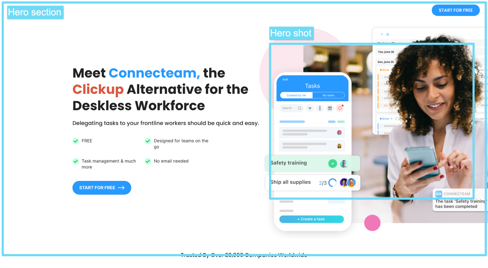
The “hero shot” is a graphic depiction of your service or product that is displayed in a prominent location on the page and is targeted to the right users and audiences while supporting the headline and overall messaging. A powerful hero shot can foster empathy and increase interest in your product. A picture of your actual product or staff would be more credible than one taken from a stock photo. Keep in mind that happy customers could boost conversion rates.
Suggested Read: How does eCommerce customer feedback can boost conversion rates?
List of Benefits
Include a thorough justification of the advantages of your offer. It is always a good idea to group the benefits into bullet points rather than one long paragraph for ease of reading. A problem’s description should be concise and free of superfluous adjectives. Keep your message simple and direct while communicating with your prospects.
4 Easy Steps to Optimise Landing Pages in eCommerce
Step 1: Identify the Driving Components
Finding out what drives visitors to your landing page and what they hope to gain from your website is the first phase in eCommerce landing page optimization. Marketers must discover who is visiting their landing page and why in order to do this. To find out who is visiting a website, one common approach is to look at website analytics; a companion option is to set up an on-page survey to ask visitors their names and reasons for visiting. When a company from a particular case study that deals with divorce services began poring over Google Analytics data, they discovered that:
- Many visitors came from direct searches and clicked through from the main online homepage to the section that they were looking for
- By a wide margin, visitors who moved from the homepage to this second page had the best conversion rates of all homepage visitors.
- This product received far more interest than any other on the website, even the DIY options
Step 2: Identify Roadblocks Preventing Conversions
Focusing on the factors stopping visitors to a particular landing page from converting is the second step in landing page optimization. What turned them off, alarmed them, or irritated them enough to have them leave? Two effective tools that can assist you in tracking the precise behaviors of actual (anonymized) visitors to your website and determining their browsing patterns are session records and heatmaps. You will begin to see trends after listening to a number of these recordings that show when and why folks didn’t convert.
Step 3: Identify Reasons That People Convert
Finding out what motivates your consumer base to act is the third and last element of the CRO program and landing page optimization. You can decide what to increase your efforts on by being aware of what is currently attracting conversions. One method is to use post-conversion surveys or polls that ask respondents directly about the factors that led them to convert. After analyzing the data, you can categorize the key factors depending on how frequently they appear. Reading website evaluations and the transcripts of user discussions is another technique to find hooks.
14 Best Practices for Landing Page Optimization in 2026
Make Your Offer Clear
If you want to increase your conversion rates, use this knowledge on your landing pages. When you are first developing your optimization approach, consider how you may encourage the customer to feel good. You want them to feel informed, valued, motivated and enthusiastic. Consider the precise objective of your target audience before creating a headline.
Simplify Your Landing Page
Although it may seem paradoxical, a very straightforward landing page eliminates visual clutter. Your call to action is the prize you want website visitors to concentrate on. Take Dropbox as an example. The business makes fantastic landing pages that say a lot in a few words. While implementing landing page optimization, make sure to highlight aspects that you would want your customers to observe so that they are more likely to proceed further.
Use Contrasting Colors
The contrast in color and clarity has been used to great effect on the best landing pages in the industry. Calls to action can be highlighted in bold, dynamic colors to encourage customers to click it while the actual content can have light, modern colors that are easy to read.
Keep the Important Section Above the Fold
Newspapers are where the phrase “above the fold” first appeared. To encourage readers to buy the paper after seeing the headlines, the most alluring stories were published on the front page, above the standard newspaper fold. You can achieve eCommerce landing page optimization by keeping your landing page elements above the digital fold or the point at which a visitor must scroll to see more content, which may achieve the same result.
Since more people are utilizing smartphones and tablets, this is more challenging than ever. The good news is that you can maintain your headline, a few sentences of body copy, and a CTA front and center while using a scroll map to quickly determine where the average fold appears on various screens.
Use Scarcity Techniques
“Limited time” and “limited quantity” are among the most popular marketing catchphrases for a reason. Using this tactic in your landing page optimization makes customers feel like they are compelled to act immediately by the sense of scarcity because they fear missing out if they wait. Even large-scale retailers such as Target employ it. Create a limited-time deal or offer a lead magnet, like a live webinar on your own website to get the same results. A countdown clock can also give scarcity a visual component. It provides a deadline for visitors to respond to an offer.
Keep Your Call-to-Action Buttons Straightforward
A call-to-action button shouldn’t make the reader anxious or perplexed. Make your offer simple, direct, and understandable. You’ll see that most businesses avoid using flowery language or complex offerings in their landing pages. The following words are the most commonly used:
- Sign up to Download
- Try for Free Here
- Sign Up Now
Add Contact Information
There are many various methods by which you can give your website visitors your contact information. Your landing page can include your phone number, email address, or contact form. Links to other companies’ support pages can also be provided, including your marketplace or other subsidiary companies that you own. Customers are already aware that help centers contain contact information, responses to commonly asked issues, and tutorials.
Try Different Headlines
In a world dominated by images and videos, the text of a landing page is still important to achieving landing page optimization. Make sure your target audience will be interested in reading what you publish. On your landing page, experiment with A/B testing different titles. Run A/B tests and make changes to the body copy to observe how those components fare.
Be Consistent With Your Brand Image
While the brand-consistent message is crucial now more than ever, conversion rates can also be greatly affected by aesthetic consistency. Consider that if you run a Facebook advertisement that directs users to your landing page, you would want the landing page to reflect the text, photography, and other components of your advertising. They ought to have a similar outward appearance and make the same pitch. If not, your potential consumer will become frustrated or perplexed.
Add Testimonials to Convert Leads
Customers really like social proof. People should be aware of other customers’ interactions with a company. One of the finest methods to do this is through testimonials. You will have an advantage over the competition if you can persuade your clients to record a video testimonial. As long as you provide the customer’s full name and ideally, a headshot, quotes also perform nicely.
Experiment With Forms Sizes
Some marketers think that the best forms are the shortest possible. “Only request the email address,” they advise. Anything more would be excessive. However, that is not always the case. A lengthy form may be better if you want to qualify leads for a costly good or service. Although you may receive fewer leads, they will be of higher quality. For a web design company, for instance, finding out the potential client’s budget can save you a ton of time. If your minimum package starts at Rs. 20,000, a client searching for an Rs. 500 design is unlikely to use your services.
Optimize Your Landing Page for SEO
Every day, people use organic search to locate landing pages. Perhaps one of your landing pages serves as your home page, in which case it should — at the absolute least — appear when someone searches for the name of your business. You can also achieve rankings for keywords associated with your industry through landing page optimization. To choose the most appropriate terms for your landing page, use programs like Ubersuggest or Semrush. Use the suggested keywords in the body text, picture alt text, headlines, and other places.
Try an Exit Popup
If a visitor tries to leave your landing page, an exit popup shows on the screen. It is an additional chance to generate a conversion. They are less intrusive than popups that start appearing as soon as a person enters the site or just starts to browse. To entice readers to click, use attractive visual graphics, a persuasive title, and CTA text. Consider offering a special discount or another incentive to encourage the exit popup.
You can develop A/B test versions as well as exit popups for specific pages on your website using a tool like Hello Bar. Aside from receiving a lot of helpful information, you’ll also learn how to attract people who opt to stick around thanks to your timely promotion.
A/B Test Every Aspect of Your Landing Page
Your data gets more accurate the more A/B tests you do. Every A/B test should have just one modification to one variant, like your CTA. This will help you understand if your landing page optimization is successful or not. If you alter several variables, you won’t be able to tell which one affected the conversion difference between the two types. After gathering data and getting to know your audience, you can put what you’ve learned into practice with a redesign and use A/B testing to confirm that it increased your conversion rate.
Conclusion
Landing page optimization requires the utmost attention because it generates the majority of new leads for your company. Take into account the aforementioned details, alter these lead generation sites as needed and raise conversion rates as it will result in more sales and increased growth for your company. If you need assistance with fulfilling orders generated through your landing pages, consider partnering with WareIQ.
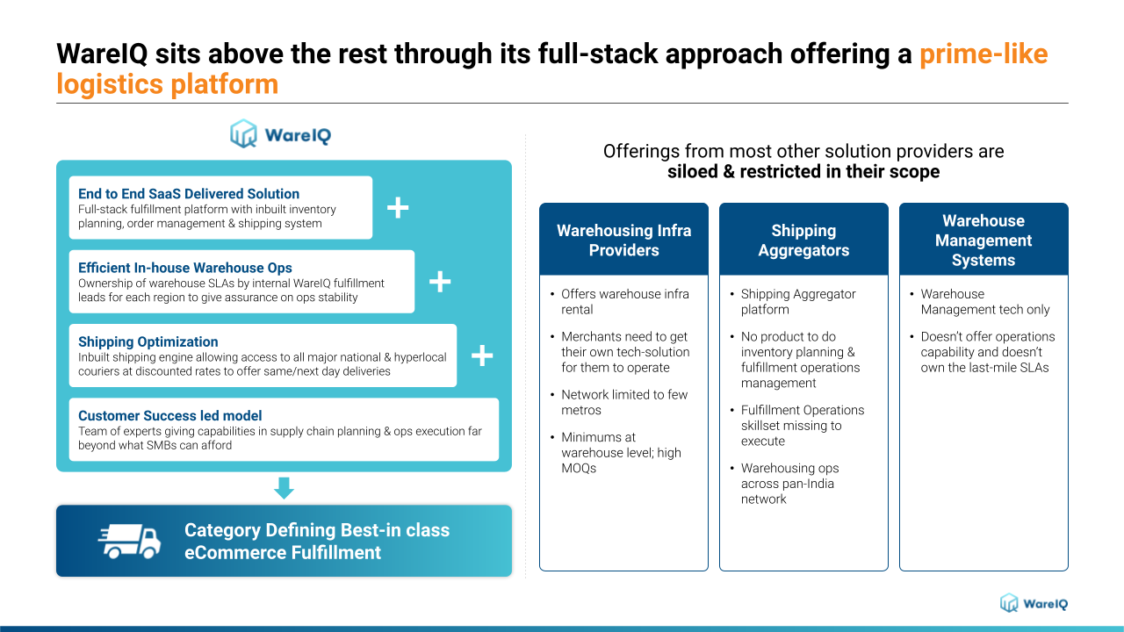
WareIQ is one of the leading eCommerce fulfillment companies in India. We provide a variety of services and provide access to advanced technology to our users. Some of the facilities we provide include:
- A nationwide network of fulfillment centers
- A custom WMS that can track inventory in real-time across multiple fulfillment centers
- Integrations with more than 12 online selling platforms
- Ultra-fast delivery through a choice of more than 20 shipping aggregators
- A custom app store with a variety of downloadable apps


